
Connected Design System

Overview
When I was first introduced into the ConnectedLife team, we had about 5 products across desktop, mobile, tablet, and large monitors. Most of ConnectedLife’s products were for enterprise (B2B), accompanied by a consumer (B2C) app for their customers or patients. As we went through the plans for expanding into more products and taking on more clients and partners, it was clear that a more consistent, efficient and systematic method was needed to facilitate the building and development of those products. I took lead of kicking off and introducing the design system to other designers and developers.
Goals
Reduce design and development time, more focus on UX
Visual consistency between multiple products
Modularity for easy customisation per enterprise’s use
Clients
Some of our partners and clients include Johnson & Johnson, Roche, FitBit, Singapore Health Promotion Board, National Neuroscience Institute, SMRT, Adventist Home for the Elders, and Red Cross Singapore.
Products
Our main product is an enterprise B2B dashboard. Based on different clients and partners’ requirements, the system they choose to adopt will have different modules. In some cases, the system might also consist of a B2C consumer app, and/or a device (eg. FitBit Ionic) for their customers or patients.

WHY did we do it?
The Connected design system was created closely following Brad Frost’s atomic design principles. Atomic design is a framework where small building blocks (atoms), such as typography and colors, can be combined together in many different ways to form larger components (molecules), such as buttons and search bars. Components could be combined in many different ways to produce pages, such as a landing page, and pages could be lined up in various sequences to form modules, such as an on-boarding flow.
From Brad Frost’s website:
One of the most attractive aspects of these frameworks is speed. Frameworks like Bootstrap allow designers to get ideas off the ground quickly, rapidly create prototypes, and launch sites sooner. Because the patterns provided by a tool kit are already cross-browser tested, developers can spend their time on more important tasks rather than beating their heads against a table testing some archaic version of Internet Explorer.
As a lot of other large companies also had existing design systems, we referenced and learned from their documentation to inform our system, ensuring that we had a strong foundation when we begin.
How did we do it?
We began by auditing the existing designs - compiling what elements and molecules already existed in our live products - and tried to retain as many viable building blocks as we can. During the audit, similar atoms were standardised, and atoms which existed in many versions were de-conflicted. All of the changes were documented and thus was the first version of the design system.
As we continued to iterate on features and build new products, we would add new elements, components and patterns into our design system. Using a shared Sketch file with a Plant plug-in, the designers would always be able to push new changes into a shared file, and pull any changes made by other designers into their own file. The shared file would be a library in the cloud that had reusable and constantly updated components.
Connected Design System

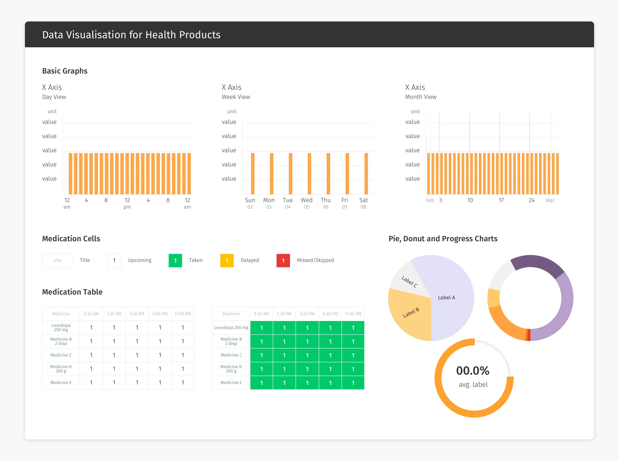
Establishing the basic rules and atoms of our design system would then allow us to combine atoms in multiple ways to achieve a whole range of components easily and efficiently.

Separate pages were created for health dashboard specific components, and living solution specific components. Each component is documented with names, specifications, and a brief summary of how and when to use each type of data visualisation component.
Putting it all together
By establishing and implementing a design system, our design and development team are able to work more consistently and quickly, with less repeated work. The design system also allows the design team to focus on more important tasks, like functionality and user flows.
