
mSAFRA App

UI/UX Revamp
SAFRA National Service Association is an organisation that was formed as a recreation club for servicemen from the Singapore Armed Forces (SAF). Their app, mSAFRA, had been released the year before with a goal to provide a personalised SAFRA experience to their users, 25 - 40 year old men who were SAFRA members. Our team was tasked with proposing a design that optimised the user experience and prioritised personalisation. I took lead for the ideation and design phase of the project.
Scope and deliverables: User Interface Design, user flows, copywriting, front-end style guide.
Discover & Define
To start the project, we first conducted an audit of the app bearing the client’s goal in mind.
Key issues found:
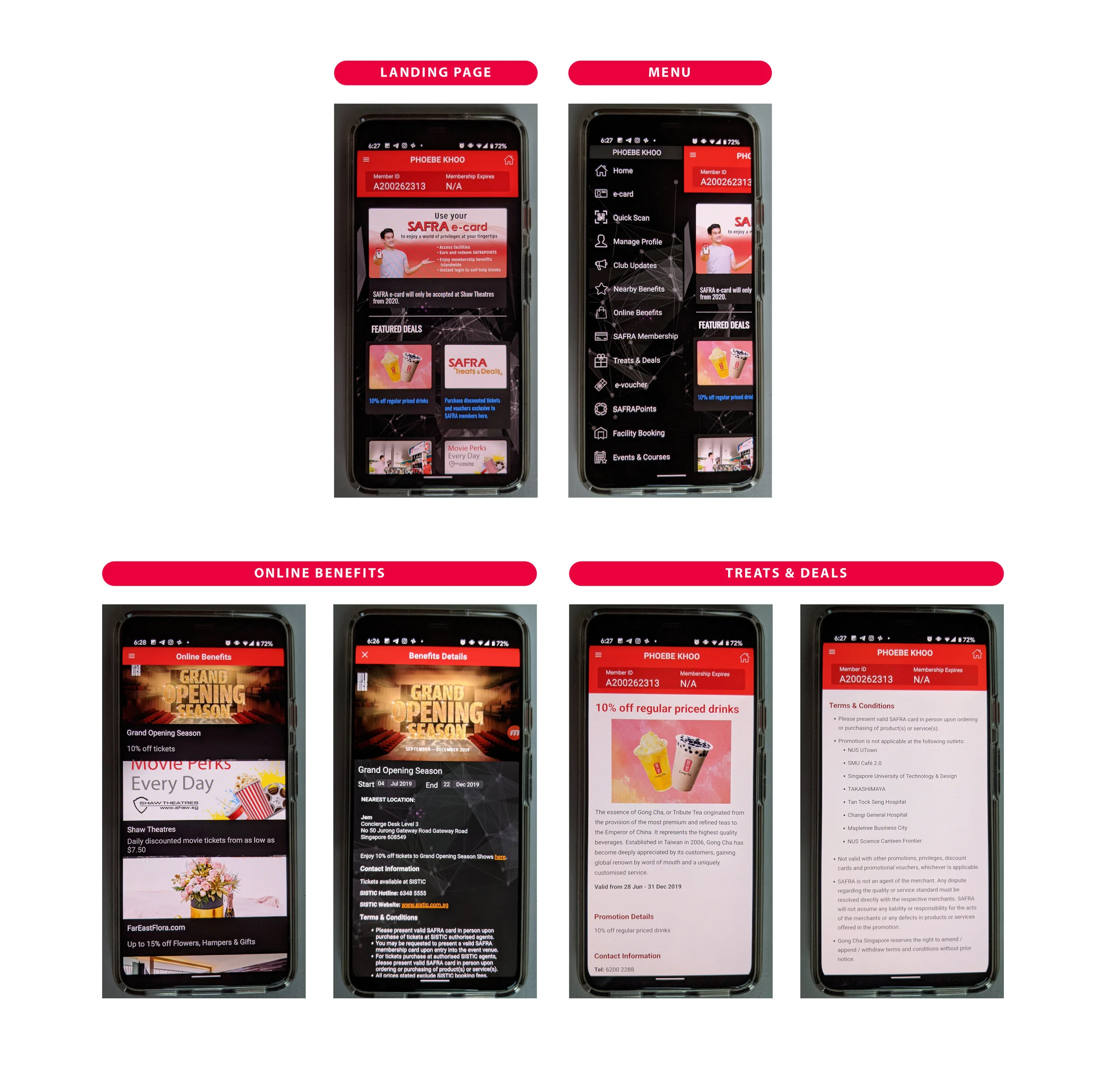
Home page had no focus point, displayed irrelevant information
Poor organisation of information on multiple pages, resulting in poor navigation
Menu was extremely content heavy with items named similarly
Dark UI worked against SAFRA brand colors, making text illegible
Content was generic and not curated
We also discovered that on release, the app featured functions such as GPS enabled display of nearby SAFRA benefits, live updates on pool and carpark usage, and online purchasing of selected treats and deals. None of these functionalities was found in the current app. The app aimed to incorporate additional functions such as the booking of SAFRA facilities via the app in the following year.
The research team then conducted studies on existing SAFRA members and presented the following findings:
Deals and promotions attracted users to sign up as a SAFRA Member, but less than 20% of these members make use of their SAFRA membership benefits.
More than 75% of the respondents said that they never use the SAFRA app
Users found navigating the app confusing and could not locate certain pages of the app
Users want more accurate search results
The app’s loading time could be faster
Users would use the app to book facilities and purchase promotional items
App references mentioned included EventBrite, UOB Mighty, and Fave
Problem Statement
SAFRA members need a way to get more out of their SAFRA membership privileges because they are unaware of the full extent of SAFRA’s benefits. Our solution should provide users with an intuitive way to be notified of relevant promotions.
Solution Statement
By recommending deals and promotions that are personalised to a user’s interests and location via an intuitive and easy to use product, users will be motivated to use the mSAFRA app. We will know this to be true when we see an increase in usage and purchases via the mSAFRA app.
Ideation and Design
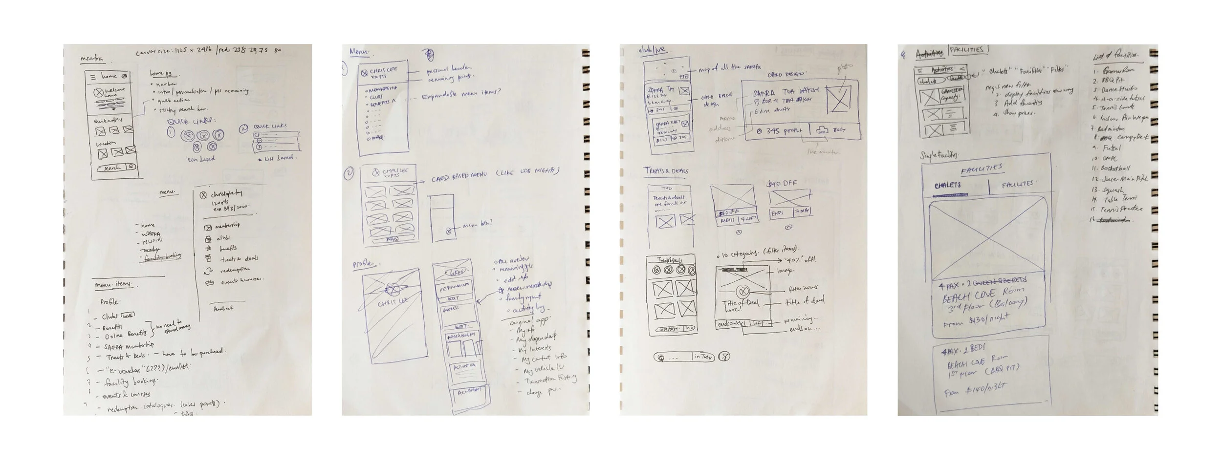
A SAFRA brand guide was made available for us to follow. Besides the main brand colors, SAFRA also had a unique colors for different branches. We used these colors throughout the design in the new app to create a stronger brand connection.


Part of the styleguide delivered


