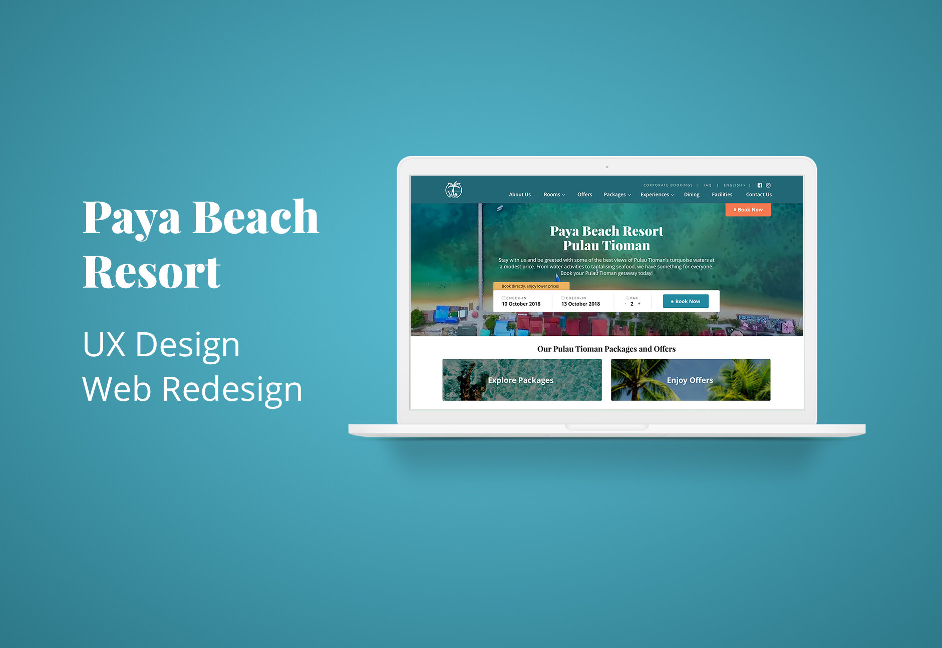
Paya Beach Resort Redesign
UX Design • Web Redesign
I was given the opportunity to redesign Paya Beach Resort website with the goal of increasing direct booking/conversion rates. Our team worked closely with the client, whom gave us access to Google Analytics data, insights, and in-depth information regarding the next steps for his business.
The project is currently undergoing development.
Methods used:
Cognitive Walkthroughs, User Research, Business Research, Persona, Customer Journey Mapping, Content Strategy, User Flow, Wireframe, Prototype, Visual Design, Usability Testing.
Duration:
3 Weeks
Tools Used:
Sketch, Anima, Google Slides, Google Analytics
Try the working prototype of the redesigned website here.
Overview
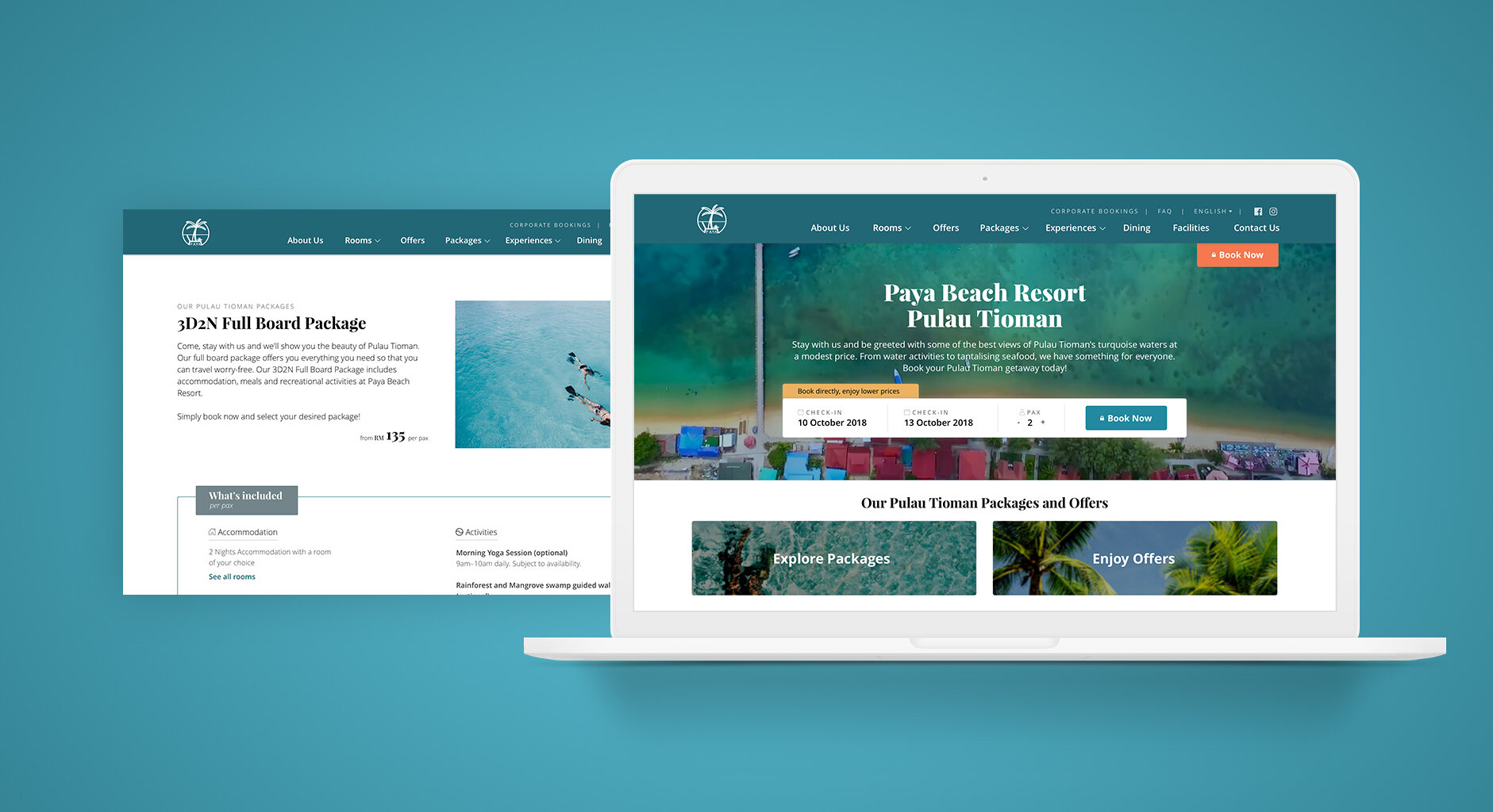
Paya Beach Resort is located at central western shores of Tioman Island, Malaysia. The resort offers a range of experiences at affordable rates. The client wanted to increase conversion rate of direct bookings through the website by implementing strategic user experience and improving the overall user interface.
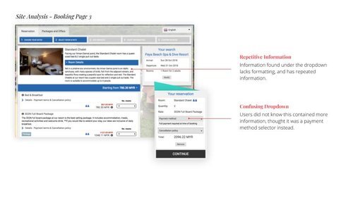
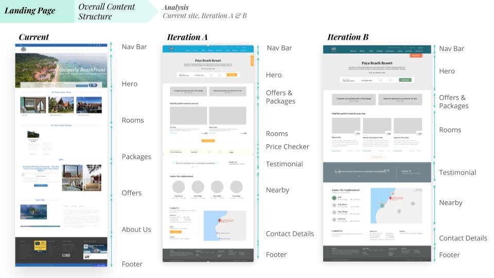
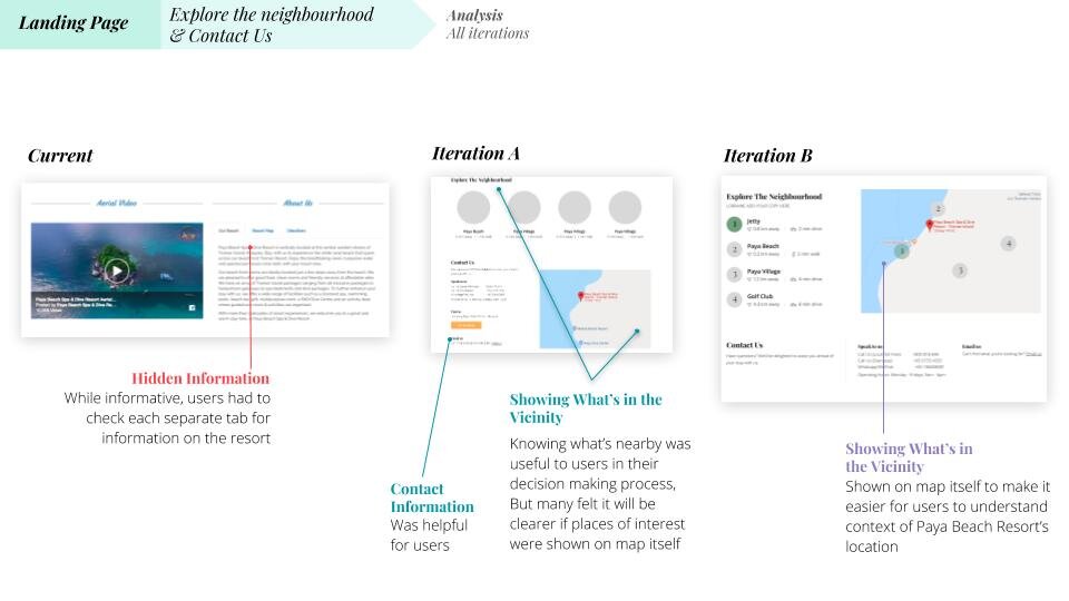
Our team discovered high drop-off rates at pages such as the landing and packages page. By interviewing and understanding our users’ browsing and booking behaviours, we found that our varied and price-sensitive target audience were not engaged at the landing, and could not find what they were looking for on the website.
The client had requested to place emphasis on pages where Google Search was currently directing traffic to. We had to understand how the website’s SEO worked and take them into consideration for our design decision.
Solution
By focusing on key decision making factors that affect our different customer segments, we will be able to engage them on their first point of contact with our website with relevant information, ultimately increasing conversion.
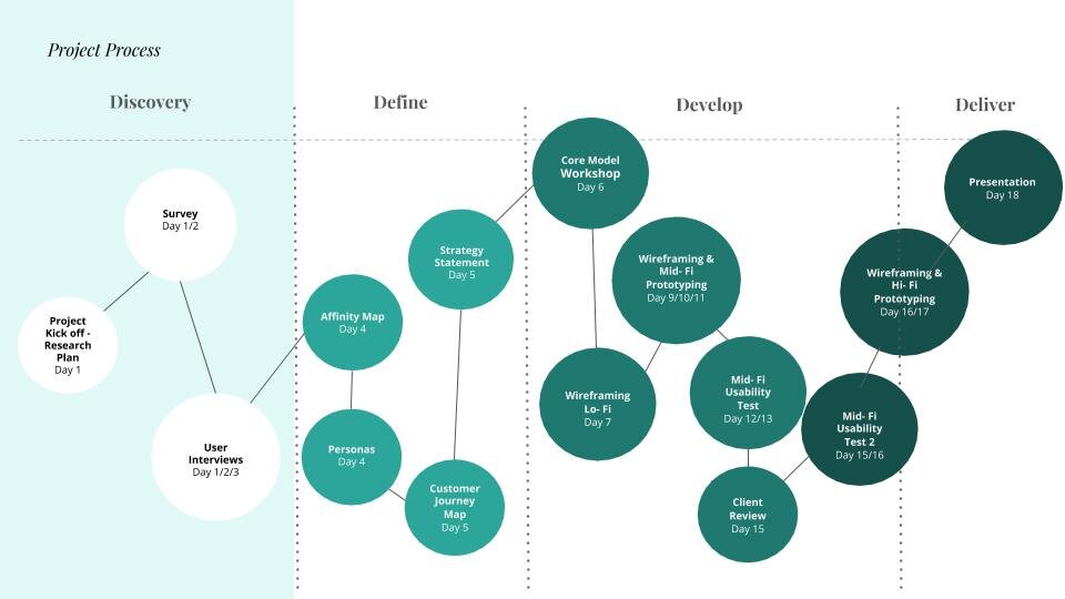
01. Discovery
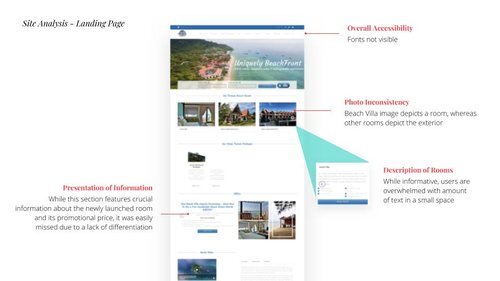
Our team did a competitors’ analysis, business value proposition, and business model canvas to better understand the position of Paya Beach Resort(PBR) as a business. User research, which included interviews with 7 participants who frequently booked beach holidays was conducted to understand our target users planning, booking and traveling behaviours, habits or processes. Surveys were also sent out to 23 people to find out more about the type of information they needed to book their holidays. A site analysis helped us understand problems they faced when using the current site.
We presented personas to our client so that he could better understand and relate to his target users, and customer journey maps gave him insight to their pains points as they were using PBR’s website.
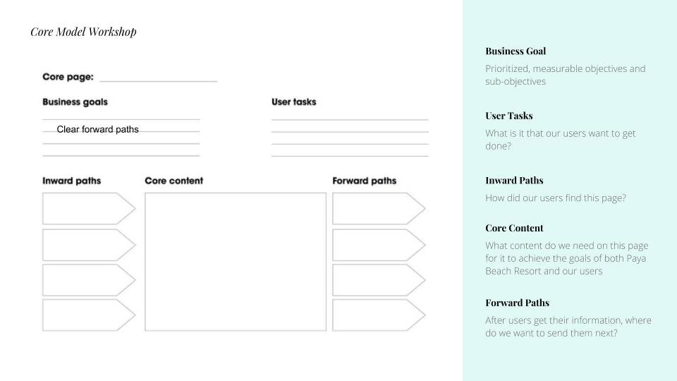
Our team worked with the client to do a core model workshop, where we gathered his input on what the business goals were for each page of the website.
02. Process and Solution
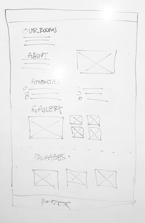
We worked on the wireframes together as a team. By sketching low-fi wireframes on a whiteboard first, we were able to gather input from the entire team, allowing us to move forward in the same direction with confidence.
I translated our whiteboard wireframes into mid-fi prototypes and we conducted 2 rounds of usability testing. Feedback, changes, and iterations were detailed in a deck for client’s referencing and understanding.
Taking into consideration the short timeline of the project, the client had dropped mobile responsive screens as a deliverable. However, we made sure that elements we used in our design were mobile-friendly and could easily stack in a bootstrap framework.
03. Prototype
Try the working prototype of the redesigned website here.