OVERVIEW
Singapore Land Authority (SLA) is a statutory board under the Ministry of Law in Singapore. SLA optimises land resources for the economic and social development of Singapore. As an agency, SLA has a suite of digital services that serves Public Officers, Lawyers, Estate Agents, and other Members of the Public.
ROle
I was the sole Product Designer working on this Design System. I worked with the various System Owners and their vendors for implementation. My responsibilities include the UI design and UX consultation.
Problem
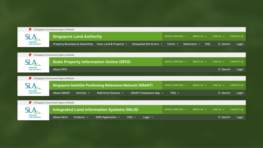
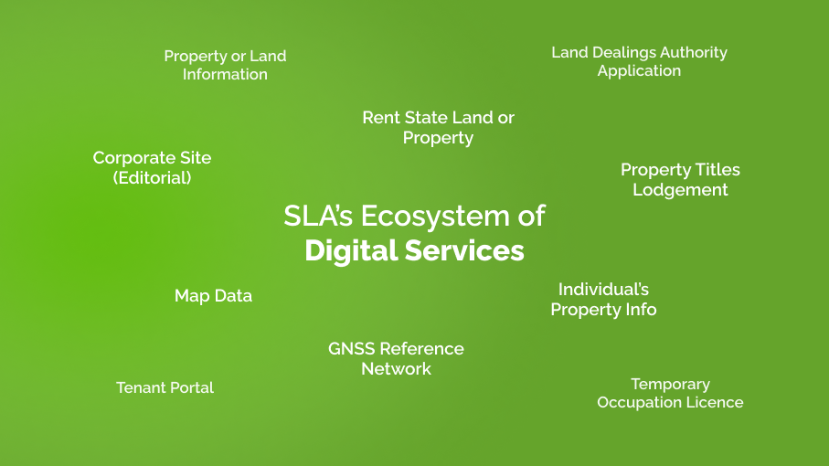
SLA’s growing ecosystem of (9 and growing) digital services have inconsistent user experiences as the various systems are managed by different system owners and vendors. Development takes extra time, money and effort when different vendors ask the system owners for UI specs and create the same components from scratch. In worse cases, they might create an entirely new UI for a digital service that looks visually different from the rest of the services.
Solution
By creating an accessible and shareable design system that is the “source of truth” for all design specs, we ensure a consistent visual and user experience across all SLA services. Having a design system will also allow the system owners to focus their efforts on their user’s solution, rather than on the system’s UI.
Process
To start, I did a simple walkthrough with all the system owners to understand what each system was about. I gathered basic information such as the name of the system, what it does, who are the owners, users, production status, and planned updates.
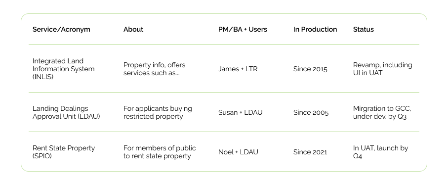
Sample of a part of the table used to track each system. Data in table are examples.
Then, I conducted a component audit, evaluated the user flows, and mapped my findings on Miro. Concurrently, I also consulted Singapore’s Design Service Standards and other .gov.sg websites to find about more about the service standards for Singapore government websites.
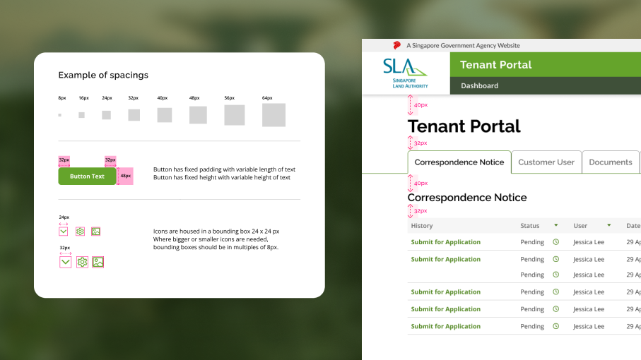
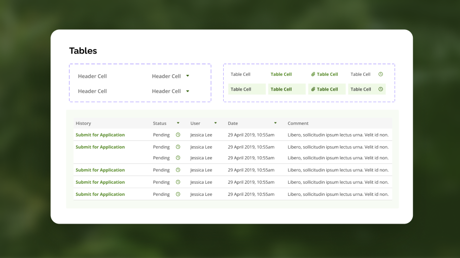
Components
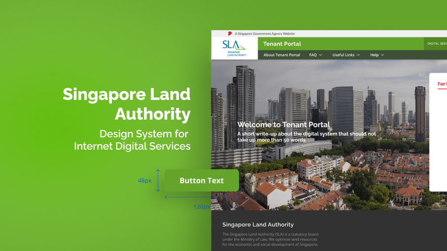
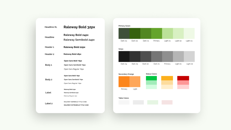
I first worked on the common components such as typography, colours, buttons, input fields, and tables. These components were guided by the audit done earlier. To help users understand how these components would be used, simple rules were documented in the design system along with sample layouts to give users a visualisation.
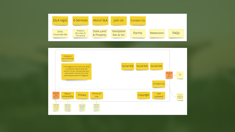
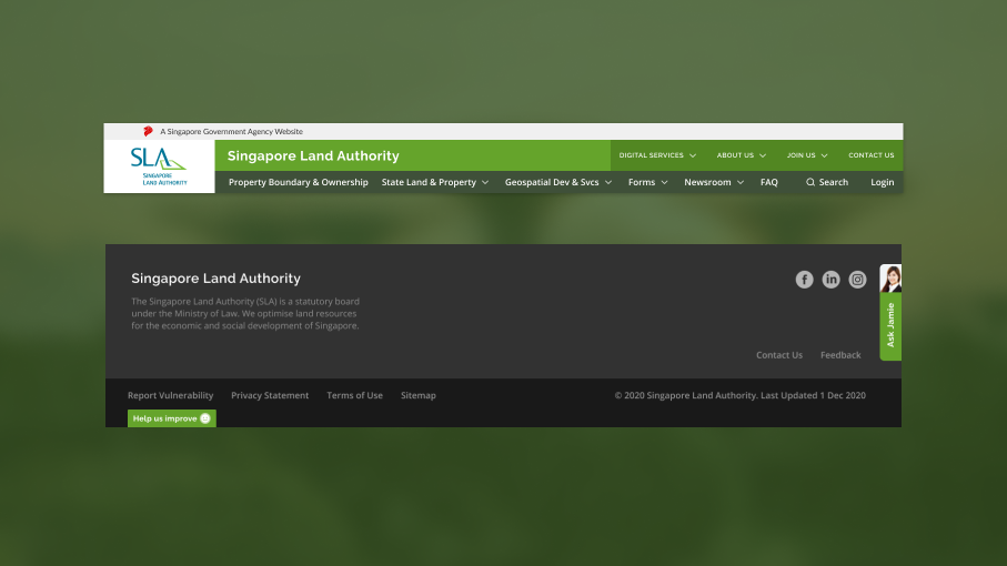
Header and Footer
For the headers and footer, I started by creating wireframes to get the information architecture right. The two global elements that should be consistent between all services - that would be the template to use across all the sites. The links used in the headers and footers were also standardised. As each service also had their own requirements, I allowed some room for local elements (i.e. elements that were unique to the service).
All the headers, footers, components and layouts are kept in a Figma library. The link of the library is then shared to all system owners, which is further shared to their vendors. As the ecosystem of services is still growing, the team makes it a point to note down components which are not available in the design system. I would then create the missing component in the library, and all system owners and vendors would have access to the new component. In this way, the design system is an ever growing document. Vendors would also be able to use the design system to create prototypes for their system owners as well.